
Boston Office of Recovery Services
Website Widget
Designing an inclusive and playful landing experience for Boston Office of Recovery Services, final project for MIT 4.051 The Human Factor in Innovation and Design Strategy.
-
Role & Team
product designer
-
Timeline
13 weeks
-
Tools
Adobe Animate, Photoshop, Illustrator
Overview
In collaboration with the City of Boston’s Mayor’s Office of Recovery Services (ORS), the course uses Human-Centered Design methods to address the real-world problem: how might we support Boston ORS in making their recovery resources better understood, accessed, and utilized. My design solution is a short interactive animation accessed as a clickable button on ORS’s website that tackles language diversity and accessibility, creating a welcoming, playful, and hopeful experience as users navigate ORS’s resources when first encountering the office’s website:
5 Boston’s most spoken languages are featured in the animation, to create a sense of inclusion for Boston’s non-native speakers.
The animation uses colorful and hand-drawn illustrations to make the experience playful and inclusive for all.
Under each section for the languages, resources are translated to the designated language, and users can make appointments or view more resources on the website directly from the animation.

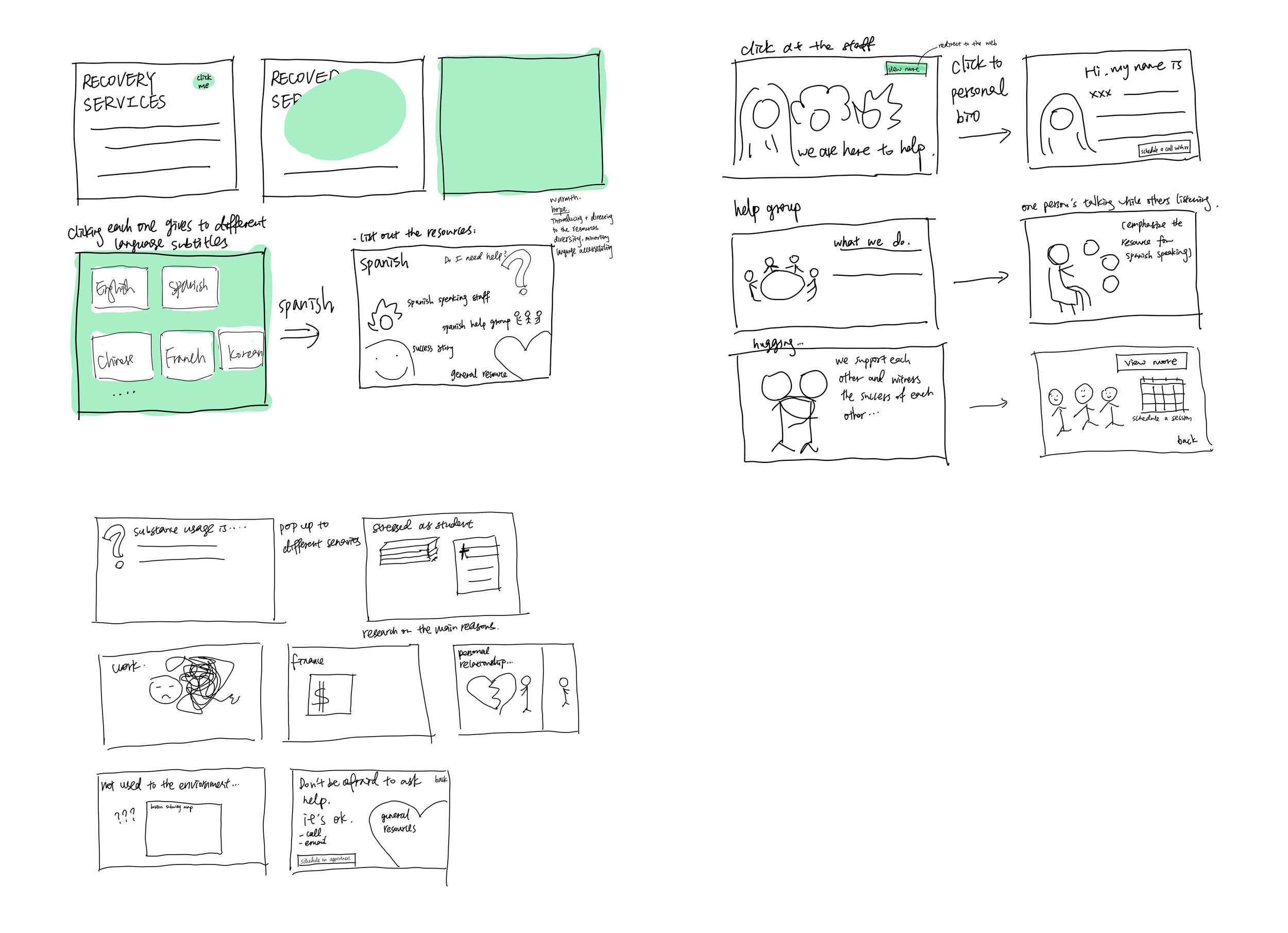
Click to enter as a website button
Preserving the professionalism, clarity, and minimalism of the original website, I chose to add a clickable button on the website that would bring to the animation that’s in a different visual design, instead of redesigning the entire website experience.

Introduces ORS’s resources in different languages
Clicking into each section of the language would bring to resources of ORS in the designated language: staff bios, help group, identifier questions, success story, and ORS’s general resources, as they are the most frequently mentioned resources during our field research.

Brings staff closer to life
The staff bio section contains a short introduction to each staff who speaks the designated language or of the specific cultural descendant. Viewers would feel more comfortable reaching out to the resources if they identify with the staff, and they can directly make an appointment with the staff with the link at the end of the bio. In general, the short introduction would bring the staff of ORS more approachable and closer to life.

An example of the Chinese version
The Spanish version above uses English subtitles to demonstrate the content of the animation, while this Chinese version gives a realistic example of such content in different languages.
Design Process

EMPATHIZE
Warm-Up: Understanding Context
With the focus of the project “recovery” in mind, I conducted in-context observation in several retail stores to practice empathizing, learning to understand people's functional needs and deeper emotional needs.
Learning Goals
Understand the deeper emotional need and mentality of people seeking substance-use
services.
Understand the obstacles people face when looking for recovery help, both mentally,
physically, and socio-economically?
Understand how much people know about substance-use resources.
Understand how people view the Office of Recovery Services. Where are they getting the
perception from?
Understand people's impressions of substance use. Understand what people think substances
are. (Research Stimuli)
Field Research (interviews)
We conducted three interviews based on our learning goals and interview protocols above, then summarized our interview findings in the miro board below:

DEFINE
Opportunity Statement
Our team grouped together findings in our interview and generated the most frequently mentioned themes. We then summarized three opportunity statements that we find are the most constructive to work on:
How might we create a welcoming environment for non-native speakers in order to make
recovery services more accessible?
How might we increase the exposure to successful recovery stories for homeless substance
users in order to give them hope towards recovery?
How might we partner with local and religious institutions in order to offer services to people
who wouldn't otherwise trust or access governmental services?
「How might we ACTION WHAT for WHOM in order to CHANGE SOMETHING? 」
I focused on the first two opportunity statements.
Brainstorming

IDEATE
Market Research

The design style of ORS’s website is minimalist and informative, but a little unapproachable and aloof. I then researched some substance-usage prevention and education videos on Youtube. Their doodling style and the colors attract people to watch and video, also making it more approachable and inclusive.
Visual Narratives

Based off on the previous research, I proposed several design solutions: a poster campaign emphasizing language diversity; redesigning ORS’s website to make it illustrative and colorful; adding staff bio and success story sections on the website to make staff more approachable; making a short public education animation and play it on the subway.
After evaluations, to preserve the professionalism, clarity, and minimalism of the original website, I narrowed down to making an interactive animation opened by clicking on a button on ORS’s website. I combined the idea of poster champion and introducing ORS’s resources together, aiming to design an experience that’s playful and light-hearted, introduces ORS’s resources, and emphasizes its inclusiveness.
PROTOTYPE & TESTING
Paper Prototype
Final Prototype


Heuristic Evaluation
Overall, the prototype uses a creative media format as interactive animation, and it brings a welcoming and playful experience to users. The use of bright colors effectively expresses the idea of inclusion and light-heartness of recovery, prompting users to explore more about the Office’s substance usage recovery resources after “playing” with the animation. The touch on language diversity and accessibility is also very important in the process of design thinking: always think about who do we design for, and what do we want to achieve. Some potential improvements are:
Think more about color-coding: why do you use blue for Spanish and yellow for Chinese, are the colors culturally appropriate?
The office’s website has a color scheme to follow (blue, red, yellow), the button most likely wouldn’t violate the color scheme because it only shows the colorful animation after clicking. However, you still need to put the contextual constraints in mind while designing.